FOTD: Kaleidoscope Colours (Using Morphe Live in Color Artistry Palette)


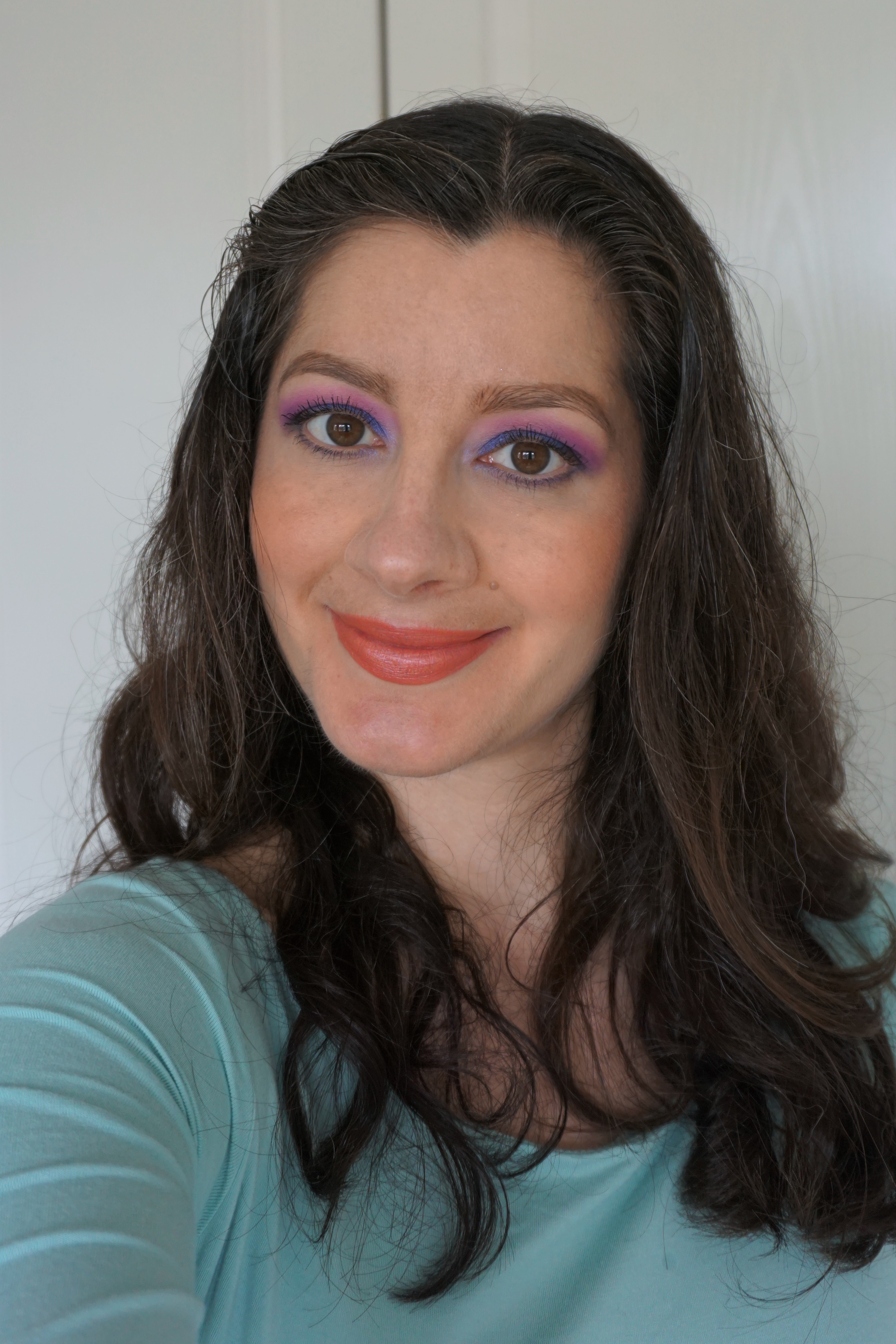
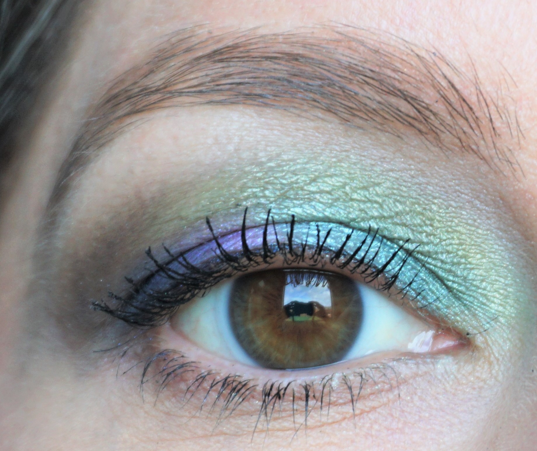
The Morphe Live in Color Artistry Palette was one of my top products from 2019 and a palette I continue to reach for in 2020 (you can read more about this palette here).  I find the colour selection so inspiring and it really encourages me to try out different eyeshadow combinations whenever I use it.

I found this look from last year in my look folders and thought it would be a fun one to post.  I remember I wanted to try something very bright and came up with this multi-coloured look with a cut crease and a halo effect on the eyes.

Click ‘Read More’ below to see the full look breakdown, find out what I used on the rest of my face and view more photos.

Click here to view my post on this palette, see photos and view swatches.

Looking for more look ideas using the Morphe Live in Color Artistry Palette? You can find other combinations and look ideas here.

Are there any products you would recommend from Morphe? This is my first time to try out anything from the brand so I would love to hear your suggestions!

Continue reading

FOTD: Aquamarine and Purple (Using Morphe Live in Color Artistry Palette)


I love the shimmery aqua tone of Make Magic in the Morphe Live in Color Artistry Palette (you can read more about this palette here) and thought it would look beautiful on the lids alongside Heart and Harmony.  I really love how the shades blended together in this look.  I used Heart (a matte pink) in the crease and it created a blue-ish shade where the edges met Make Magic.  This step really added extra dimension to the look.

Click ‘Read More’ below to see the full look breakdown, view full face shots and find out what I used on the rest of my face.

Click here to view my post on this palette, see photos and view swatches.

Looking for more look ideas using the Morphe Live in Color Artistry Palette? You can find other combinations and look ideas here.

Are there any products you would recommend from Morphe? This is my first time to try out anything from the brand so I would love to hear your suggestions!

Continue reading

FOTD: Teals and Red (Using Morphe Live in Color Artistry Palette)


I really wanted to try out the bold, matte red in the Morphe Live in Color Artistry Palette (you can read more about this palette here) and came up with this bold red, blue and purple look.

Click ‘Read More’ below to see the full look breakdown, view more photos and find out what I used on the rest of my face.

Click here to view my post on this palette, see photos and view swatches.

Looking for more look ideas using the Morphe Live in Color Artistry Palette? You can find other combinations and look ideas here.

Are there any products you would recommend from Morphe? This is my first time to try out anything from the brand so I would love to hear your suggestions!

Continue reading

FOTD: Greens and Corals (Using Morphe Live in Color Artistry Palette)


I thought it would be fun to combine some of the greens and orange shades in the Morphe Live in Color Artistry Palette (you can read more about this palette here).  I really love how the shades blended together in this look.

Click ‘Read More’ below to see the full look breakdown, find out what I used on the rest of my face and view more photos.

Click here to view my post on this palette, see photos and view swatches.

Looking for more look ideas using the Morphe Live in Color Artistry Palette? You can find other combinations and look ideas here.

Are there any products you would recommend from Morphe? This is my first time to try out anything from the brand so I would love to hear your suggestions!

Continue reading

FOTD: Bold Blue and Pink (Using Morphe Live in Color Artistry Palette)


I couldn’t wait to try out Rise Up from the the Morphe Live in Color Artistry Palette and came up with this bold blue and pink combination.  I love the contrast of pink and blue on the lid and the shades also blended together to create a purplish effect in the crease.

Click ‘Read More’ below to see the full look breakdown, view full face shots and find out what I used on the rest of my face.

Click here to view my post on this palette, see photos and view swatches.

Looking for more look ideas using the Morphe Live in Color Artistry Palette? You can find other combinations and look ideas here.

Continue reading

FOTD: Hot Pink and Gold (Using Morphe Live in Color Artistry Palette)


I used the Morphe Live in Color Artistry Palette to create this bright, summery gold and pink look.  I feel so inspired by the wide range of bright colours and finishes included in this palette!

Click ‘Read More’ below to see the full look breakdown, view full face shots and find out what I used on the rest of my face.

Click here to view my post on this palette, see photos and view swatches.

Looking for more look ideas using the Morphe Live in Color Artistry Palette? I have some other looks on my Instagram page (@makeupbysairalee) and will also have more coming up on the site.

Are there any products you would recommend from Morphe? This is my first time to try out anything from the brand so I would love to hear your suggestions!

Continue reading

Naturally Sparkly With Inglot 114 Pigment


Inglot 114 Pure Pigment Look

Inglot 114 Pure Pigment Look


I’ve been enjoying trying out products from Inglot recently and picked up one of their pure pigments – 114 – to try out.  This pigment really stood out to me, as it contains a gorgeous mix of light blue, green and aqua sparkles. 

The product can give a softer sparkle when patted on dry or yield a high shine glimmer when applied damp with a mixing medium.  I think it’s such a beautiful shade and can’t wait to experiment with more combinations!

Click ‘Read More’ below to see the full look breakdown, view full face shots and find out what I used on the rest of my face.

Looking for more posts on Inglot? You can read my other posts on this brand here.  You can also find posts from Inglot – or other brands – by going into Faves, Hauls & Brands/Brands on the menu bar.

Are there any products or shades you would recommend from Inglot? I’m just starting to try out products from the brand so I would love to hear any of your suggestions!

Continue reading

Teal and Brown Flying Hummingbird (Using Various Brands)


Teal and Brown Flying Hummingbird Look

Teal and Brown Flying Hummingbird Look


The fourth look in my Bird Series (you can read more about the series here) is based around the Teal and Brown Flying Hummingbird.  There are so many different shades in this bird’s colour scheme – teal, green, bright blue, bright purple, brown, glints of black and white – which I thought would make for a really interesting look.  The look was a challenge for me, as it’s been a while since I’ve attempted to combine such a wide range of colours all just on my eyes! I really like how it turned out and think it is one of my favourite looks in the series.

You can view full face shots, along with the cheek and lip colours I used, in this post.

Teal and Brown Flying Hummingbird Photo From Pexel (free photo site)


The Bird Series includes looks based around different types of birds and their colour schemes.  You can read more about the series and view posts here.

Tip: I used a wide variety of eyeshadow singles and shades from palettes for this look, as there were so many different colours to combine together.  You can read more about the shades I used below in the ‘Products’ section.

Continue reading

Robin (Using Kat Von D Saint and Sinner Palette)


Robin Look

Robin Look


The third look in my Bird Series (you can read more about the series here) is based around the Robin. Robins have a really interesting mix of colours and tones – brown, deep burnished orange and white – and so I thought this would be a fun combination to try out.  I used a slightly more red-based shade to tie in with the stereotype of Robins being ‘red-breasted’, even though they seem to be more orange-based in real life. 

You can view full face shots, along with the cheek and lip colours I used, in this post.

Robin Photo from Pexel (free photo site)


The Bird Series includes looks based around different types of birds and their colour schemes.  You can read more about the series and view posts here.

Tip: I used the Kat Von D Saint and Sinner Palette for this eyeshadow combination.  You can read more about the palette, see photos and view swatches here.  You can also view other combinations I have created using this palette here.

Continue reading

Flamingo (Using Too Faced Just Peachy Palette)

Flamingo Look

Flamingo Look


The second look in my Bird Series (you can read more about the series here) is based around the Flamingo.  When I was browsing photos of flamingos online, I was struck by the variety in the colours of these birds.  The colour schemes seemed to range from cream, peach, coral, pink and vivid red.  I knew that flamingos could come in different colours but hadn’t realised there was quite so much diversity.  Nice to learn something new!

I chose to base my look around flamingos with white, cream, peach and coral-red feathers, along with black-ish beak tips (see photo below) For this look, I incorporated the white, cream, peach and coral-red on the lid and deep brown/black on the upper lashline.  I also used a bright peachy-coral on the lips to tie in with the bright coral red feathers.

You can view full face shots, along with the cheek and lip colours I used, in this post.

Flamingo Photo From Pexel (free photo site)


The Bird Series includes looks based around different types of birds and their colour schemes.  You can read more about the series and view posts here.

Tip: I used the Too Faced Just Peachy Mattes Eyeshadow Palette for this particular look.  This particular palette has a good range of creams, peaches and plums to choose from and fitted with the colour scheme for this look.

Continue reading